
For half a year now, I’ve used Flipboard as my main News reading application as it’s simple, you can see six of your new feeds at once and includes some of the nicest animations in a news reading application in the Google Play Store. However, recently I wanted to branch out and see if I could find another news reading application to use that followed the Holo design ethic a bit more closely as I want my phone to feel as Nexus-like as possible. My first thought was Press as that is a recent application that shows the beauty and simplicity that Android has to offer with some of it’s apps, however I didn’t feel that the app warranted the £1.89 asking price that the developers had set out. There were no killer features that made this app worth that money; if it were free or even below £1 I would definitely have jumped on the bandwagon, however unless I feel I really want to review it, I won’t be paying that money for the application.
After rejecting Press, I turned to Google Currents which is a FREE Google-made news reader application that when I previously used it wasn’t attractive and didn’t allow you to submit your own feeds, it only pulled it on current Google reader feeds. However, as I’ve learnt over the past few days, Google Currents has come a long way and now features beautiful Google Now-like animations and smooth scrolling, a menu tray to the left and the allowance to add your own feeds in. With all these new features, I felt that Google Currents could temporarily, if not permanently, take over from Flipboard for me.
Google Currents is a Google application through and through, it features the three-dotted option menu at the top, the Menu tray to the left and what I believe to be the future of Google apps, the Google Now-like animations when scrolling through articles. The application as a whole is just beautiful which is something you really have to commend Google for doing over the past couple of years, making Android and their applications the best looking on the market.

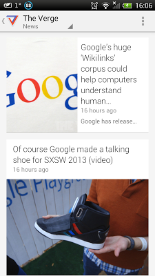
Let’s run through the layout of the application first. As aforementioned, you have your three-dots in the top right for options. Here you can search, sync now, view settings and look up help. Within settings you get account options, translations, download over wifi, enable background sync etc. The usual kind of settings you expect to find in any basic News application. Along the top, you get either the category you are in, or the logo and name of the news feed you’re reading from. In the top left, you have an arrow which opens up your menu tray, or you can access this by swiping from off the screen. Within your menu tray you have your new categories which are preset and I don’t think you can add categories, because the news feeds you add have already been categorised. My most used category by far is Science & Tech, in which I have The Verge, Android Central, Engadget, Mashable, The Next Web and then the other feature that is in all categories, the ‘Breaking Stories’ section that shows the latest and hottest in news. I assume this is similar to what’s trending on Twitter with the most interesting latest news appearing here. This feature also appears within your selected news feeds which is signified by a little fire in the top right of the article showing they’re ‘Hot’ right now.


When you open a news feed, you are presented with a Google Now-esque news feed with simple squared with large photos and the titles of the article and how long ago they were posted. When scrolling down, you get the Google Now animation where they slide up from below which is a really nice effect. When you select an article, it opens with the main image at the top, the title below and then obviously the rest of your article below that swipes horizontally. There are a few options when you’re in an article, such as the little button in the bottom left which allows you to quickly bring up a peak-view of the other articles within this news feed meaning you can stick to that website and just read articles from them. However, it took a little getting used to to remember this accessed THAT feature and din’t take you back to your menu tray. Other options whilst reading an article include the ability to skip to the next article with the skip button in the bottom right which is a nice feature meaning if you see an article title that doesn’t appeal to you, you can skip to the next. Your other options are other News Reader-type options such as changing the font size, saving the article (unfortunately not to Pocket) and then sharing the article (fortunately you CAN save it to Pocket here.)


‘Simple but elegant’ is what Google have been pushing over the past couple of years with the introduction of Jelly Bean making everything smoother and simple and the included Google Now. Google Now being a heavy likeness to this currents apps with the cards-like feature and almost identical animations. This application really shows these design ethics and so I think this is one of the more beautiful news reader applications out there.

In day-to-day use, this application caused me a few problems because the menu tray is extremely hard to access and takes quite a few attempts to access. However, if you do have the simple button in the top left to quickly access it, but if you’re going to add a slide-in menu tray, they it would be nice if it worked every time. Apart from that, this application worked nicely, it was easy swapping between news feeds, easy seeing what the each news story was about thanks to the large images and text. I also liked that once you've read an article, it is greyed out and so you know which articles you've read; you can also choose in the settings to hide articles you've read if you'd prefer.
The application does have its flaws, a few I’ve already mentioned. The biggest flaw for me is the fact the menu tray hardly ever works and you have to access it via the button, not a massive killer but would make the app nicer if it worked every time. Also, the button in the bottom left when in an article is a little confusing as the icon represents the menu tray, but actually shows the other articles within that feed. The whole in itself may take a little getting used to and feels weird that some places you have to hit the back button on your phone and others you can access with swipes and on-screen button taps. However, these are things that can definitely be learnt over time.
Overall, this application is a beautiful alternative to any News Reader application and the fact that it’s free does really add a nice reason to download and at least try the application for yourself. Despite being a little confusing in places, the application’s beauty and holo-based design really does make this an application I’m willing to learn.
Usability – 8.9
Options – 8.0
Presentation – 9.1
Dependability – 8.5
OVERALL - 8.6
| Google Currents Download |
What News Reader application do you use? Do you think that Google are right by making their app designs slowly all follow Google Now? Will this be overtaking your current News application?
No comments:
Post a Comment