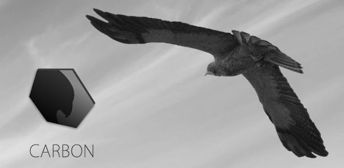
Carbon for Twitter Application Review


When you turn on the application, you’re brought straight to your timeline, there’s no messing around here. Unfortunately, there’s no automatic refresh so you’ll have to do the ‘Pull-To-refresh’ we’ve come to know and love. Once this has processed, a number will appear that will indicate how many new Tweets there are; now to scroll through 200 would simply take too long and so Carbon has cleverly introduced the ability to use two fingers to scroll which shoots you to the top of your timeline; simple but intuitive. To access mentions and direct messages, it’s the usual swipe to the left which has become pretty standard on every Twitter app (except the ugly official client.) You can Tweet by hitting the plus at the bottom which brings up a nice simple screen with three buttons along the bottom: a camera icon, people icon and your Tweet icon. Within the camera option, you can ‘Take a Picture’, ‘Last taken’, or ‘Choose from Gallery’. In my opinion, I can’t see ‘Last Taken’ being used too often as if you wished to tweet a picture you’d just taken, you often go to your gallery to check it’s of a good quality first and then you can share it from in there. However, if you’re certain the shot you’ve just taken is the one you want to upload, I guess you can choose this option. The little people icon at the bottom simply adds an ‘@’ symbol which I guess could be a little quicker than the two taps to access it in your keyboard. When you do hit the ‘@’ symbol and begin to type a name, it updates handles in real time for you to select which I’ve known a couple of applications not to do so I’ve had to remember my friends’ handles.


Whilst on the “home screen” we’ll call it, you have an option at the bottom to go to your own profile which shows you your Tweet count, Friend count (people you follow) Followers count and Lists. You can select any of these to view your tweets, view who you follow, view who follows you and check who’s in your lists.

In terms of options, when you select the three bars in the bottom right indicating the options, a beautiful menu slides out that allows you to enhance your Twitter experience even further. Your options are: view your favourites, view your lists, view what’s trending (you can choose your own location or leave it on worldwide), the option to search, the options to filter tweets (filter by people, hashtags or keywords; this is not search it is to filter content out of your Timeline) and your final option is the options option. Within the options option you have simple options, you can turn notifications on or off, manage accounts and then go and follow Carbon on all their social networks.


Now as I’ve mentioned throughout this entire review, beauty is a LARGE factor within Carbon for Twitter and the dedication and time taken to make this app run smoothly, fluidly, quickly and a whole bunch of other ‘ly’ words is really noticed when just scrolling around the application. When you’re first greeted, you can instantly see the design detail with the simple font and grey, wooden-like background behind your tweets. It gets better when you begin to slide to see your mentions and direct messages, you are presented with not just a sliding animation but the page actually lifts up on the right hand side almost like you’re sliding the left tab away from the right tab with your finger. It’s hard to explain, but beautiful to watch and sometimes I do it in extra slow motion just to see the beauty involved. When you pull down to refresh your feed, the timeline goes into a Star-Wars pre-text-esque animation, once again something that’s easier to try for yourself than attempt to explain. Throughout the whole application, the animations are beautiful and smooth and feel unnaturally natural (which makes no sense at all but you’ll see!) I would go as far as to say that Carbon is the best looking Twitter application out there, if not the best looking application full stop.
Now every application has it’s flaws and despite the amount of praise I’ve heaped upon the Carbon for Twitter Android application, it does have some flaws. Notifications is a huge problem for third-party Twitter applications as Twitter do not allow Push notifications to these parties and so they must find other ways of achieving this and so Carbon has hopped on the bandwagon of refresh intervallic notifications. This wouldn’t be so bad if you could alter this time difference, however you’re given 15 minutes and that is it. So the lack of push notifications or even the option to change the time between checks is a little annoying, but not a massive deterrence. Another small niggle I found was that it doesn’t send you notifications for retweets, favourites or follows and so I’ve set it up so that the Official Twitter application does this and Carbon sends me my tweets every fifteen minutes. This means that Carbon isn’t my sole Twitter client when it really could be.
However, with the ability to do pretty much anything you can think of on Twitter and the pure beautiful, speed and reliability of this application, I can’t help but recommend it, if not for it’s brilliant experience, at least for the beautiful animations. The application has been regularly updated since its release but unfortunately will likely be halted due to the fact that only 100k tokens can be used with the application which is a real shame considering this applications potential.
Usability – 9.2
Options – 9.4
Presentation – 9.8
Dependability – 7.8
OVERALL - 9.0

Thank you for reading, below is a list of places you can follow me or ask me questions at:
Twitter: @luke_harkness
Tumblr: luke-harkness.tumblr.com
Instagram: @luke_harkness
No comments:
Post a Comment